
Spencer GT.
YouTube thumbnail.
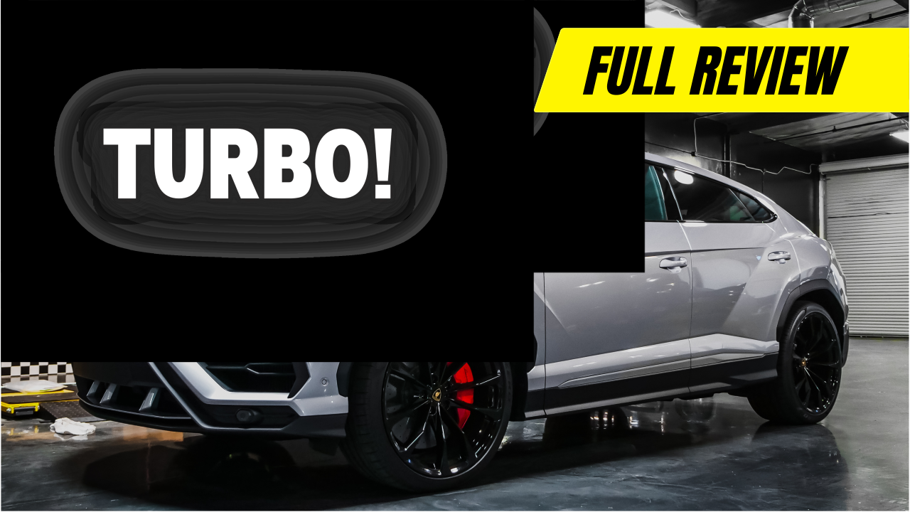
I built this thumbnail around the car, oversized Motion lettering and a yellow “Full Review” tag. The idea was to make the subject and the promise of the video clear in one glance.
Thumbnail design
Vector typography
2026
Why this layout.
The car fills the lower half of the frame. That leaves room for the title above it, with the garage setting still visible enough to give the image some context.
I kept the palette close to the photograph: black, white and the red details on the car. The yellow tag is the strongest colour in the frame, so “Full Review” is easy to find.
For this 2026 direction, I wanted fewer elements and larger lettering. One subject, a short headline and a clear label give the eye an easy route through the image.
The type does
the heavy lifting.
Motion lettering
I chose Motion for its heavy, condensed shapes. The letterforms give “SPENCER GT TURBO!” enough presence to hold up against the car, while the tight proportions leave room for the image.
A black panel behind the title
The dark panel separates the white lettering from the garage. It keeps the headline readable where the photograph has pipes, reflections and other detail.
The yellow Full Review tag
The slanted tag gives the composition a little forward movement. Black lettering on bright yellow creates a second clear reading point after the main headline.
The lettering and graphic shapes are vector artwork in the supplied SVG. The car and garage are photographic elements.
It has to work small.
A thumbnail is usually much smaller than the canvas it was designed on. These previews show how the headline and yellow tag hold together at feed size.
Give people a reason
to open the video.
The thumbnail and video title work together. Large type catches the eye; the words need to tell someone what they are about to watch. “Full Review” sets that expectation quickly.
Impressions click-through rate shows how often people choose the video after seeing its thumbnail. I would compare that with watch time, then test another headline or crop to see which version brings in viewers who stay.
YouTube recommends readable thumbnail text and checks title-and-thumbnail tests against overall watch time. That is a useful way to judge the design once the video is published.
YouTube’s thumbnail and title guidance ↗How YouTube evaluates thumbnail tests ↗