
 Latest work
Heavy Duty Tire.
The shop redesign.
I redesigned HDT’s online shop, from the equipment finder and location map to the typography and scroll animation.
Take a look around ↗The original site
and the redesign.
I started by looking at how customers search for tires. Some know the size. Others know only the machine they need it for. The redesign gives both a place to start.
We started with the questions a customer actually has: Do you have a tire for my machine? Can someone check the fit? Where can I get help nearby? Those questions shaped the navigation, the finder and the order of the page.

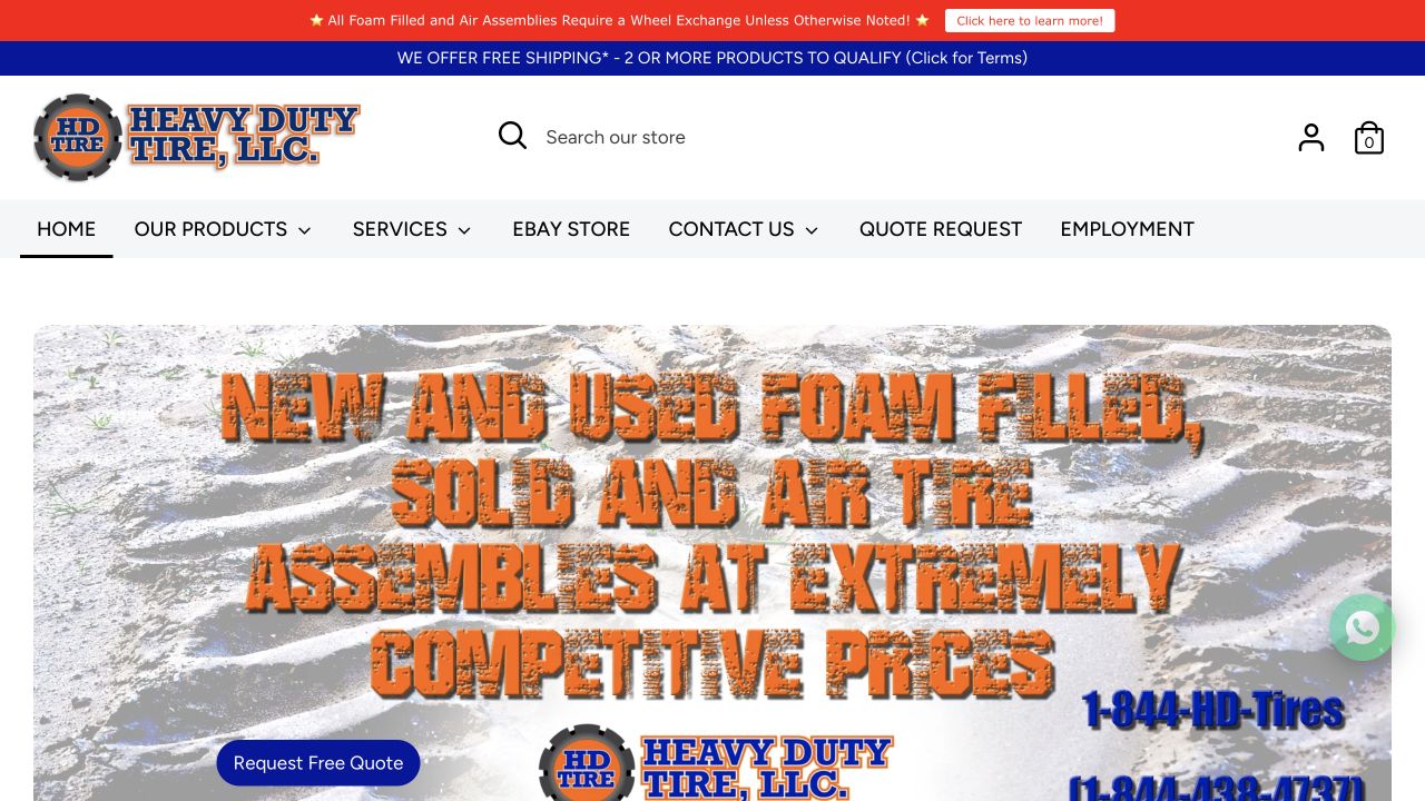
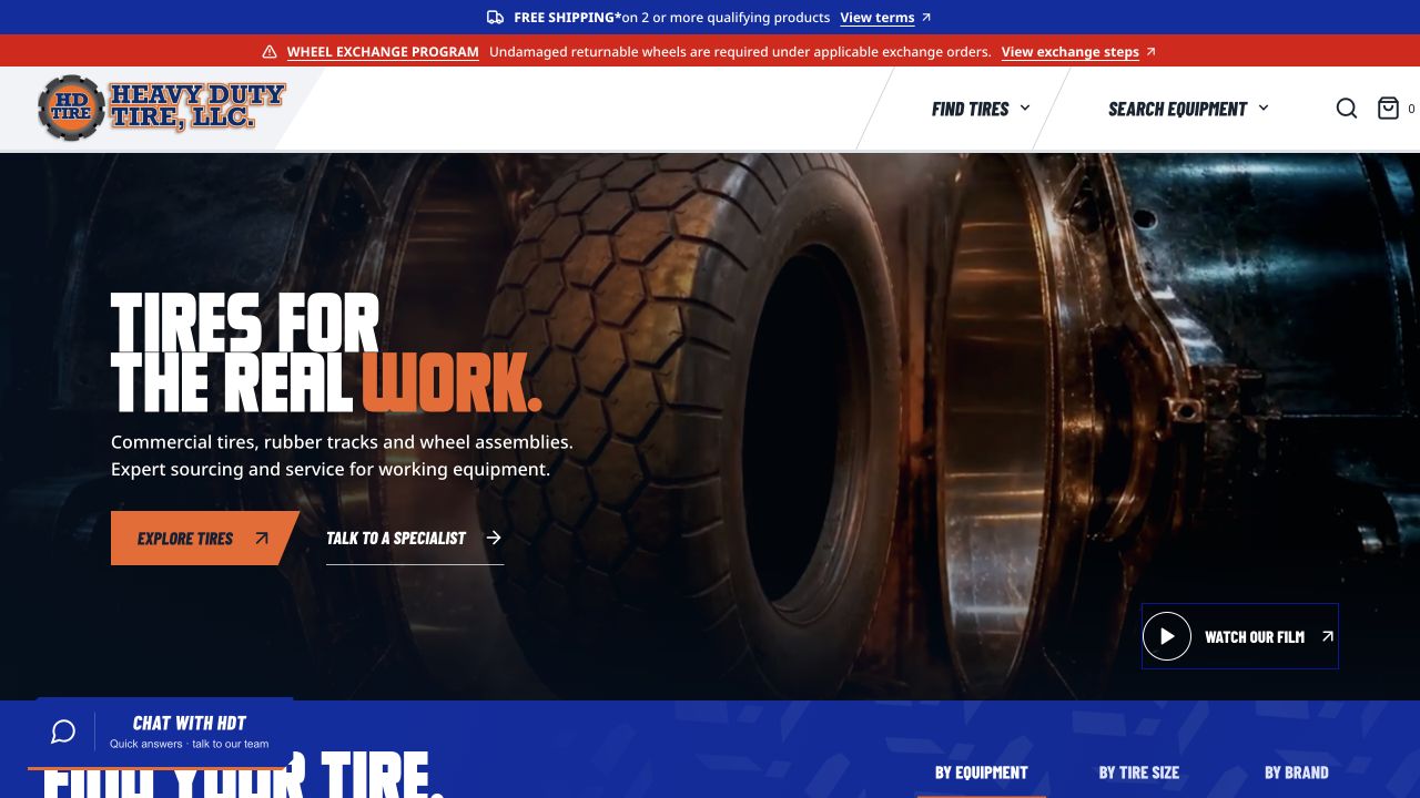
Both are still captures of the actual storefronts. The original theme has been preserved; the new experience is live at shop.heavydutytires.com.
Explore the website.
Scroll inside the website, open the menus and try the finder. Switch to a phone-sized view to see how the layout changes. The guided view uses our Next.js build; the live shop opens separately.

The homepage brings product discovery, service and HDT’s people into one place. Scroll within this window to explore.
Open the live shop ↗THE REAL WORK.
Typography and color.
I chose Headliner for the headings because its heavy, condensed letters suit HDT. It also connects the shop to the corporate website.
The menus use Barlow Condensed. Product descriptions and form labels use Noto Sans, which is easier to read at smaller sizes.
We kept HDT’s blue and orange. White gives the products breathing room; black keeps the main headings crisp. Orange marks the next useful action.
#1428A2Orange
#F36522White
#FFFFFFBlack
#000000
A wheel that
follows your scroll.
I wanted the retailer section to show the tire in motion. Its rotation follows the page scroll, with a ground shadow and dust beneath it.
We built the tire in Blender, then rendered its rotation into 64 frames. Those frames are packed into one WebP sprite sheet. Scroll progress chooses the frame, so the wheel responds to the visitor instead of playing on a timer.
That keeps the 3D appearance without asking a phone to run a full 3D scene. Motion updates are scheduled with the browser’s animation frame, and reduced-motion visitors get a still presentation.
Scroll through this section or use the slider to inspect the rotation.
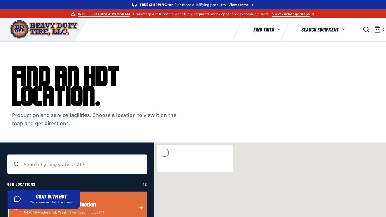
Finding an HDT location.
HDT’s network covers production and service facilities across several states. We wanted customers to find the right place without jumping between a collection of separate pages.
The location finder puts the branch list, search and map together. Choose a location and its address and directions stay in sync. The shop also points people toward the corporate website and local services, so the network feels connected.
TALK.Company news / Meet the team / New locations / Tire guides / Partnerships
Tread Talk in the shop.
Tread Talk gives company news a place in the storefront. A new service location, a team spotlight or a tire partnership belongs here alongside product guidance.
We chose a compact orange news banner because it creates a clear change of pace without interrupting someone shopping. Tire details connect it to the rest of the design. Blue category labels make the different stories easier to scan.
The banner combines company updates with headlines from HDT’s corporate site. It keeps the shop connected to the people and activity behind it, and visitors can pause the scrolling when they want to read.
How I built it.
The details needed to hold together: the equipment finder, responsive layouts, the wheel, the news and the routes back to a real person at HDT.
Next.js, React & TypeScript
We developed the custom design and working prototype in Next.js, using reusable components for navigation, discovery and locations. That gave us room to shape the experience around HDT.
A live Shopify theme
We then carried the design into Shopify’s Liquid theme system, keeping the real product catalog, cart and checkout. The live shop is Shopify; the Next.js build remains the design prototype.
The less visible work
We checked small-screen layouts, contrast, touch targets and motion. We also reconciled styles during the Shopify transfer so the controls and typography followed the approved design.
What I’m proud of.
I’m proud of this project because it goes beyond giving the shop a new look. It brings more of HDT into one useful place: the tires, the people, the locations and the work they do every day.
The wheel took careful work, but so did the less obvious details: readable menus, working forms and a location finder that makes sense on a phone. I wanted the finished shop to feel considered at every size.
Let’s talk about your website ↗